When we were in Amsterdam for the Initiative for Narrative Journalism Conference, we interviewed Daan Louter (24), the youngest member of The Guardian Visuals team, a Dutch designer and developer who combines his design and coding skills to find new and innovative ways of telling stories.
Daan started studying journalism in 2008, but decided to switch to interaction design, because he thought the university was “kind of blind to everything that was happening in journalism, where so much was changing.”
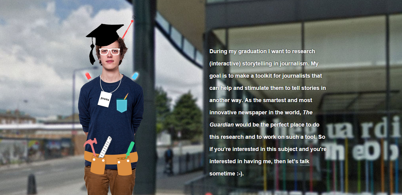
For his graduation thesis, he wanted to do his research at The Guardian, to apply his design skills to a journalistic environment. He made an interactive CV and sent it to all the Visual Team members and then tweeted it to the Guardian. He now says he’s not very happy with it, because it’s not responsive and besides, “as a designer you’re never happy with the stuff that you make”. But it became viral, having 10.000 page views in one day, and it got him the internship, and then a job. 
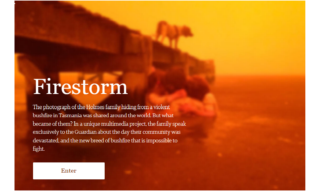
Since then, he has worked on projects like: Firestorm, an award-winning Rich Multimedia Story about how a bushfire destroyed a little town in Tasmania, Pontifficator , a tool to find out who you would vote for as the new pope or The Refugee Challenge, a choose-your-own-adventure game about entering Europe as a Syrian refugee.
When you start to design a project, do you already have the reporting done?
That’s a good question – does the design feed the content or does the content feed the design? In the case of Firestorm, which I did while I was still an intern, I started working on sketches even before the reporters went to Tasmania. We knew there was a story coming up, it was together with the launch of The Guardian Australia, so we wanted to do something big. I made a lot of different designs and sketches for a few weeks, I explored different ways of combining media and I got feedback from everybody, including the editor. That was a good learning experience, because I’m used to getting feedback from the other designers or an art director, but you learn a lot from getting feedback from the perspective of an editor, also.
But then, if you go to another country and you don’t know what it looks like, the people you’re going to interview, how willing they are to talk about stuff, you can’t really decide in advance the form of the story. Because initially we had a completely different idea for the design, and after two days the video makers sent an email saying “Look, this is not going to work”. So we thought maybe it would work better it we would divide the story into chapters, based on different perspectives on the bush fire.
So basically the content feeds the design, definitely.
What kind of projects inspired you?
People sometimes compare Firestorm to Snowfall, but I’m also happy a lot of people said it’s sort of Snowfall version 2, and I approve. I think Snowfall was just a long article with some videos and images and I think we have found a better balance of those different media. But Snowfall was definitely an inspiration for us, especially from the editorial side, because everyone in that time wanted to do a Snowfall and I think the earlier designs that I had looked more like it. But it’s pretty difficult to make something that doesn’t look like Snowfall because it’s basically an article with some footage and images.
Nowadays I get a lot of inspiration from the NPR team, I really like what they do. Another project that I really like is a video clip from Arcade Fire, the band. It’s called The Wilderness Downtown. They wanted to move away from the idea of a traditional video clip and made it interactive; what you can do is you fill in the address you grew up in, and instead of a normal video, you have all these browser windows popping, with someone running and at one point he actually runs in the street where you lived.
I think it’s so compelling, they bring an extra factor, a personal factor. I know people who watched this and they literally cried after, because it’s so strong. And this has nothing to do with journalism, but it’s a very inspiring project, they’ve used so many different factors and web technologies in order to tell a story. I love it.
How do you think digital storytelling is different than other ways of telling stories?
There are two different things: digital media provides a different canvas, and we can explore that canvas a little bit more and not just do static articles. The Wilderness Downtown thing is a good example of that.
And second is interactivity. The reader can filter information, the story is not just a piece of static information, but it’s an interactive thing you can play around with and really become part of the story. For example, in the Syria refugee project, instead of telling the story of Karima, we let you decide what the story will be. You are playing a game, but it’s based on real people’s stories.
And that helps the reader to better understand a story, if he becomes part of it?
Yes, definitely, he can experience the story better, but also understand it better, so you have all these mechanics where people can decide the tempo of the information, the tempo of the story. If you’re explaining a very different, complex subject, with interactives you don’t have to show all the information at once, you can divide the project in different steps that you can grow through and you just decide when to go to the next one, or take a step back. It can also help you experience the story better, like the refugee project, because you literally make the same decisions they had to make. And I think using the digital canvas, like The Wilderness or Firestorm, you can make the story more immersive and more powerful.
When I studied design they really hammered that in everything you do, the user is an incentive. You always design something for the user, it has to fit their needs and wants, otherwise they won’t use it. That’s stuff that you constantly think about in design. I don’t understand why journalists don’t think about that a little bit more. I noticed, when I started thinking about this, that it would be a sort of unique insight as a designer coming into journalism, and I thought it would be cool to see what I can add to the journalism world as a designer.
At The Guardian, for every project there is one designer, one journalist, one developer. We are all journalists. Not all of us are taking interviews, but we all think about how to tell stories.
How do you decide which story is better for which medium?
There are some situations in which articles are not the best ways to tell a story. For example:
1. When you have a lot of complex, data heavy information. You can try to describe it in an article, but it might more interesting to find cool ways to visualise that data.
2. When you try to convey emotions. Of course you can do that in an article also, but there are also interactive mechanics that can help you do it better.
3. When a story has a different meaning for different people. For instance, let’s sau there’s a new budget meeting, that’s a big story. If you would write an article, it would be read by a teacher maybe, a doctor, a CEO of a company, and they would all read the same article, though the story has different meanings for them. So maybe an article is not great at talking to different audiences.
4. When a story is not ’very’ exciting, but important. I think it’s pretty tricky to make a story more fun or accesible via an article. Or there are easier ways.
Don’t get me wrong, I think for most stories articles are the best way, but with digital media and new media, there are loads of more story forms available.


